
Saving an at-risk $1.6B contract renewal
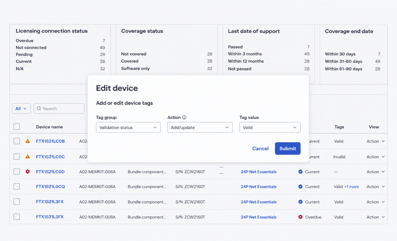
My product team at Cisco learned that a department within the U.S. federal government would not renew a $1.6B contract without a key feature that we hadn’t yet designed (the ability to tag network devices). I leapt into action with my product team to quickly design an MVP solution that would ensure the renewal until we had space in the roadmap to implement the full feature.
The context and the problem
Leadership explained that a department of the U.S. federal government would likely not renew a $1.6B contract for network licenses (and potentially not renew 3 other contracts almost as large the following year) if our product (a license management portal) didn’t have a feature that allowed network devices to be tagged. The department ran yearly audits in which they would validate the security of network devices, and in order to meet security and operational efficiency requirements, they now needed to be able to tag devices in our application as validated, not validated, or not yet audited. Previously they had been doing this manually in spreadsheets, which they found to be extremely time-consuming and prone to error.
The decision for the initial $1.6B renewal needed to happen within the next two months, and our dev teams were almost at capacity, meaning that we had to work fast to design a solution and finalize it in order to fit it into a window that our dev team had. We were used to designing on tight timelines, but in this case we’d need to work twice as fast.
Working toward a solution
The design lead and I began meeting with the PM to discuss the PRD she had begun drafting. Initially we thought that we might be able to design a full tagging feature that was already on the roadmap (allowing users to create fully customized tags for devices) that would also work for the customer’s audit purposes.
Once we started drafting some concepts in Miro though, we realized that that feature would be too complex to design and build in the allotted time. So we needed to create an MVP that would give the customer what they needed (the ability to tag devices as validated, not validated, or not yet audited) so they would renew, but wouldn’t yet have the functionality to allow users to create custom tags with any possible label. That said, we wanted to create a strong design that would provide a firm and scalable foundation for when we were able to expand the functionality to custom tagging.
Process and execution
Start a controlled terminology list
As I typically do when working on a feature, I started putting together a targeted controlled terminology list. It contained important terms (especially ones that were not yet used in the application), provisional internal definitions, drafts of other usage data (casing, acronym usage), and any research data we had on the terms. I enlisted the PO’s and design lead’s help (along with other SMEs) in defining the entries, and the list helped facilitate terminology discussions throughout the course of the design work that helped us prioritize clarity and accuracy in the UI.
Defining IA, the entry point, and primary button copy
Initially the PO advocated for adding a new primary navigation section (“Tags”) to house actions involving tagging. By showing an IA map that we created, the design lead and I were able to convince her and the rest of the product team that the most logical place for actions involving device tags was the device inventory table, and also that it’s typically best not to add in new primary navigation sections when possible.
Selecting the button copy for the entry point was complicated, as it needed to be flexible enough to accommodate future features on the roadmap. The user needed to be able to apply and manage the tags as both an inline and bulk action from the Device Inventory table, as well as in bulk by uploading an XLSX file. I offered several options for the button copy for the bulk action, including “Edit devices,” “Manage tags,” “Add/manage tags.” Initially I preferred “Manage tags” for simplicity, as the user could be adding, removing, or editing them. The PO preferred “Edit devices,” because eventually there would be other actions that fit into that category as well (managing attributes of the device) and that she hoped to include in the same flow. I thought that that label might be too generic to provide good information scent, and that it would not be ideal to (later) add more edit actions (edit device name, location, etc) to the same flow, as that would add a lot of complexity. I suggested we do some research to test these hypotheses.
Our researcher couldn’t run a study in time to give us data on the options, so I ran the options by some SMEs and the support team, and learned that most users would expect to find device tagging functionality under the category of “editing the device.” For consistency with the future roadmap I suggested that we call the action “Edit device” (but make it clear in the flow that the functionality involved adding and editing device tags), and later, when further device editing functionality was added, to add a submenu that would open when the user selects “Edit device” to offer specific actions (like “Manage tags”) within that category. We didn’t fully align on how to handle that next stage of the feature, based on engineering constraints, but that could be decided in a future quarter and we had what we needed to move forward now.
Defining the tag labels
In the future we planned to design a feature that would allow users to create tags with any group name and labels that they choose. For now though we needed tags that could indicate that a device had been audited and marked as valid, marked as invalid, or not yet audited. We discussed other label names that seemed clearer and more specific, but the customer made it clear that “Valid” and “Invalid” were the labels they wanted, so we stuck with them. The idea was that once it was possible to create any custom tag label, we would remove “Valid and “Invalid” and the customer could recreate them as needed.
The customer also wanted a third tag type (labeled “Blank: No tag”) as a default tag to indicate that the device had not yet been audited. I brought up that that could be confusing as a tag label, and that it might be best simply to not have a default tag and use “No tag” as a value in the “Tags” column to indicate a device that hadn’t yet been tagged. I confirmed with the dev team that this would work as a filter option for the table (“Valid, “Invalid, and “No tag”), and the PO confirmed with the customer that this solution wouldn’t cause issues with their audit. It’s a solution that will also work well with future versions of the tagging functionality.
A content-centered approach to iterating on the flow
We then continued wire-framing and iterating on the flow to add or update tags. The design lead, the PO, and I were having trouble aligning on how the flow should work and how to structure the options, so I led an activity that we used to map out the conversation between the user and the UI during the tagging process. The results provided some clarity and helped the stakeholders align on how to proceed. [We learned that…]
When I started thinking through the selections more I realized that some of the logic didn’t work, so I made a sandbox area and iterated on the screens. I then discussed them with the design lead and PO, and then we made a few more small tweaks to the design before the design lead mocked up some hi-fis and I did a closer review for content and visual design. I made content updates for clarity and consistency with our content patterns elsewhere in the application, which I validated as needed for accuracy with SMEs. When I had visual design suggestions (for example, making sure the correct type of banner was used and adding bullet points to banner messages for better scannability), I discussed them with the design lead and in some cases worked with the design lead and our team design system librarian to update our components.
Defining the tag labels
In the future we planned to design a feature that would allow users to create tags with any group name and labels that they choose. For now though we needed tags that could indicate that a device had been audited and marked as valid, marked as invalid, or not yet audited. We discussed other label names that seemed clearer and more specific, but the customer made it clear that “Valid” and “Invalid” were the labels they wanted, so we stuck with them. The idea was that once it was possible to create any custom tag label, we would remove “Valid and “Invalid” and the customer could recreate them as needed.
The customer also wanted a third tag type (labeled “Blank: No tag”) as a default tag to indicate that the device had not yet been audited. I brought up that that could be confusing as a tag label, and that it might be best simply to not have a default tag and use “No tag” as a value in the “Tags” column to indicate a device that hadn’t yet been tagged. I confirmed with the dev team that this would work as a filter option for the table (“Valid, “Invalid, and “No tag”), and the PO confirmed with the customer that this solution wouldn’t cause issues with their audit. It’s a solution that will also work well with future versions of the tagging functionality.
A content-centered approach to iterating on the flow
We then continued wire-framing and iterating on the flow to add or update tags. The design lead, the PO, and I were having trouble aligning on how the flow should work and how to structure the options, so I led an activity that we used to map out the conversation between the user and the UI during the tagging process. The results provided some clarity and helped the stakeholders align on how to proceed. [We learned that…]
When I started thinking through the selections more I realized that some of the logic didn’t work, so I made a sandbox area and iterated on the screens. I then discussed them with the design lead and PO, and then we made a few more small tweaks to the design before the design lead mocked up some hi-fis and I did a closer review for content and visual design. I made content updates for clarity and consistency with our content patterns elsewhere in the application, which I validated as needed for accuracy with SMEs. When I had visual design suggestions (for example, making sure the correct type of banner was used and adding bullet points to banner messages for better scannability), I discussed them with the design lead and in some cases worked with the design lead and our team design system librarian to update our components.
Solving an issue with the filter component
When the design lead mocked up the filter section for the tags in the device inventory table filters, I realized that there was some complexity to it. Given that currently there were just 2 tags (“Valid” and “Invalid”) and a third filter (“No tag”), it could theoretically just be a simple filter group (like the others) with 3 options. But this would require rework later when there were other tag groups besides validation status, because each tag group would hierarchically contain child tags. We were having trouble finding a good solution to how to design the filter group, and our design system didn’t have any out of the box solutions.
I then realized that another feature currently being worked on would need a similarly nested filter group, and discussed the issue with that feature’s design lead and researcher. The researcher was able to quickly test some designs we put together, and found that a majority of the participants (57%) favored a design that displayed a clear hierarchical relationship between the categories and sub-categories. We were able to move forward confidently with that design for both features.
Results and impact
We were able to hand the designs over to the dev team in time for them to implement it on schedule for the $1.6B DoD contract renewal, so it was a success! Our design also set up a firm foundation for the more custom tagging feature on our future roadmap.
I finalized the controlled terminology list entries and added them to the main controlled terminology list I created for the licensing applications, and I worked with the design lead to make updates to our design system components based on patterns we created.
Reflections and lessons learned
My biggest lesson from this project was that even when you’re in an extreme time crunch and have to abbreviate some aspects of the design process, a content-centered approach and close collaboration with stakeholders is still critical to producing a clear, simple, and solid design that keeps users front and center.